INTEL SECURITY CONSUMER HOMESITE
How do we impress a wildly successful brand onto a new Intel web property and provide room to scale?
With the purchase of McAfee in 2010, Intel established its intent to leverage the success of the highly successful security brand and incorporate that into its own business initiatives. In 2014, we began our journey, and in February 2016 we launched a completely re-architected web property that touches roughly 135 million North American customers every year. This is how we did it.

Please note that confidential information has been obscured or excluded from this case study.
The following views are my own and do not reflect the views of Intel Security.
MY ROLE
Phase One (Until Dec. 2015) – Responsible for helping refine the existing information architecture, and leading interaction design (included task and scenario analysis, prototyping, storyboarding, and spec creation) for the project.
Phase Two (Jan. 2016 – July 2016) – Oversaw and managed UX design for the project; including interaction design, visual design, and content requirements for both the consumer homesite and shopping cart environments.
DESIGN LEADERSHIP & COORDINATION
I helped articulate research findings to stakeholders; transforming those findings into concepts, wireframes, prototypes, and at times, mockups to respective cross-functional teams.
CROSS-FUNCTIONAL COLLABORATION
I worked alongside our consumer marketing team, engineering teams, as well as a third-party agency, Web Enertia, to ensure that our concepts and final designs were meeting the expectations of our users.
ADHERING TO PRINCIPLE
Methodologies and frameworks are easily muddled when working alongside multiple teams; many of which have their own sub-initiatives for the project. I ensured that all teams were adhering to frameworks and principles (interaction, visual, and content) set forth by our Consumer Experience Design Team.
A VOICE FOR THE USER
The first phase of the project allowed the research team and I to effectively study user behavior through various usability studies. I leveraged our findings to communicate the wants and needs of the user throughout the project life-cycle. During phase two, I ensured that all stakeholders were held to the same user-centered design principles.
PHASE one
THE BUSINESS PROBLEM
www.home.mcafee.com had been an established web property for years; sitting relatively untouched save minor content and image tweaks slated for change once a year. To make things more exciting (and the reason for minimal changes), these pages were being updated manually outside of a content management system. As you can imagine, page updates, additions, and removals were painful. Therefore, as a catalyst for this project, a new CMS was integrated; which afforded new opportunities such as …
SCALABILITY
With over 50 countries to eventually support, the team needed a better way to update these properties. A CMS would provide scalability to not only make changes quickly, but to also furnish teams and authors with robust administrative privileges.
RESPONSIVE DESIGN
Content and asset design occurred within a 768px fixed width constraint for the longest time. CMS integration would allow for responsive template creation, asset control, and optimized image rendering based on viewport size.
ANALYTICS & TESTING
The new CMS would provide our teams with additional data and analytics on a much more granular level. It affords us opportunities to make informed design decisions down the road, and furnishes our marketing organization with the foundation they need to run A/B and multivariate tests.
CONSOLIDATION
Building and maintaining a global web property for nearly two decades means that there’s a huge mess to untangle should a dependency go awry. By building reusable web components and templates, we allow ourselves to consolidate immensely and scale proportionately.
THE USER’S PROBLEM
It was no secret that our site had glaring usability violations. After completing a full heuristic evaluation, as well as competitive and data analysis (all of which will not be discussed in this case study), this much was clear:
There were too many redundant menu items as well as items that served no practical purpose to the user.
Navigation needed to be streamlined so that users could find locations quickly.
Consistency and scalability were paramount
Our problem was multi-faceted, and it was apparent that in order to be most effective, we needed to fall in love with the problem in manageable chunks. Therefore, for phase one, the team had two primary objectives:
Conduct a card sorting exercise
Obtain qualitative feedback via a series of prototypes on fundamental tasks
Both initiatives would provide a foundation for us to begin rebuilding the information architecture, which in turn would help lead to the overall redesign of the site and checkout experience.
CUSTOMER INSIGHTS
Open Card Sorting
We consolidated the number of pages on the site down to only the 40 most important or highly trafficked (via analytics). We then asked participants to break these 40 pages up into groups that made sense to them.
The data snippet below shows a handful of our chosen pages (left column) and a few of the common groups that participants chose to break them up into. At the end of the exercise, we were able to identify where users thought specific pages should belong (whether it be as a child of a particular parent, or as a parent item itself).

You can see here that roughly 26% of our participants felt that the Common FAQ page belonged under some type of customer service section.
Findings
Quantitative data wasn’t significantly different from qualitative data
Primary categories were likely to be My Account, Support, Products, and Virus Info
Users could not understand our product names (often, our feature-less products were construed as the most robust)
Page consolidation was necessary due to immense redundancy
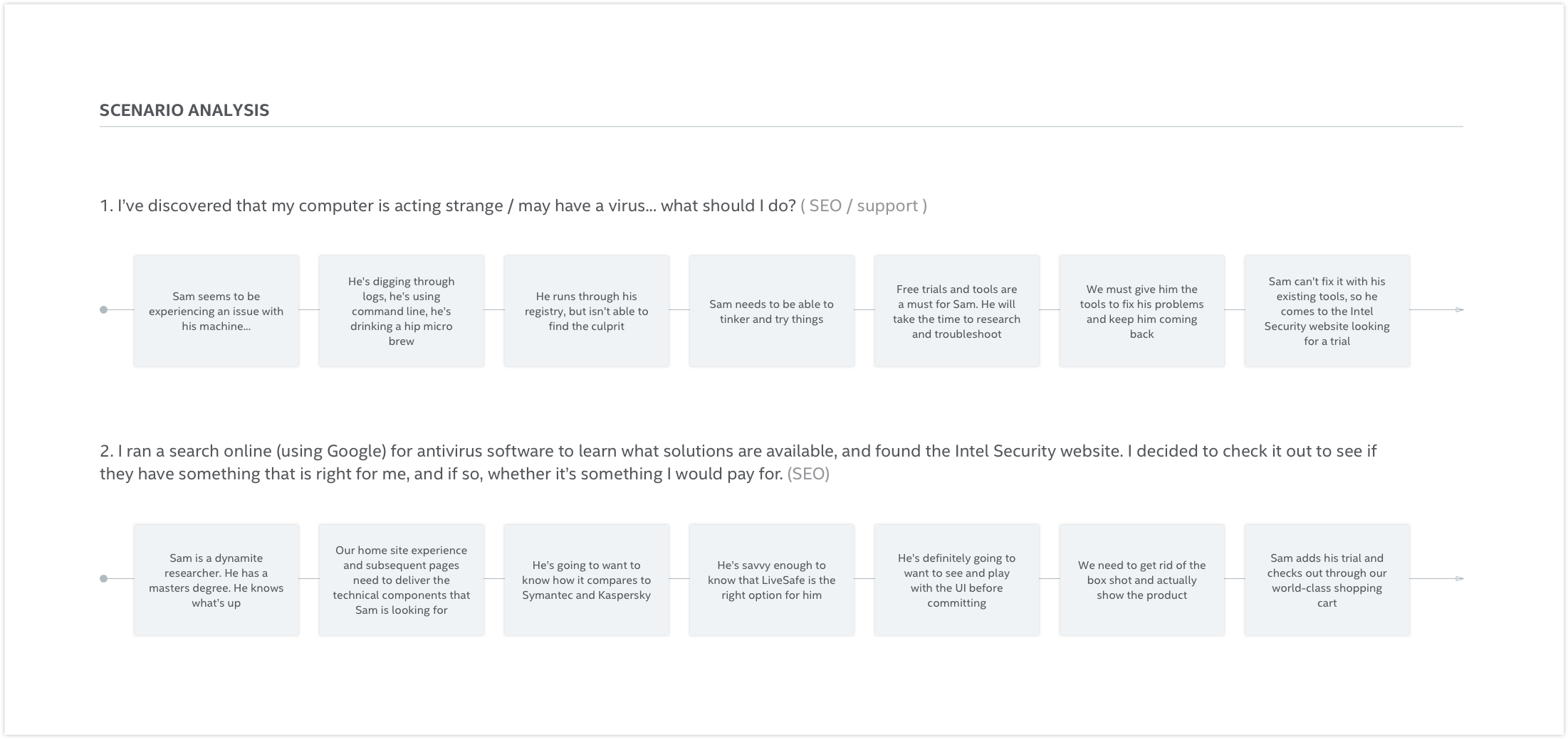
Fundamental Tasks & Scenario Analysis
Based on the card sort findings as well as our quantitative data, the following six fundamental tasks came to light.

Due to the nature of the business, not all personas were included in our target audience – only a select few. I ran the scenarios across the target audience in order to begin visualizing high level user flows, and what would ultimately become wireframe concepts.
Low Fidelity Prototypes
I now needed to understand the types of interaction patterns that stimulated user shopping behavior. Rather than provide an extensive list of products to sift through, or to simply pitch our flagship product, the goal here was to help the user quickly discover the product(s) that made sense for their specific needs.

A study using a group of 3 low fidelity prototypes (desktop and mobile layouts) was created to gather qualitative user feedback and help answer the following questions:
What are the main sections the site’s primary navigation should provide?
What do people expect to find in each primary menu item?
Are there additional My Account items needed?
What reasons would people come to the home site from a mobile device?
What types of interaction patterns build trust and encourage buyer behavior?
DISCOVERY
These insights allowed us to establish a framework we were comfortable moving forward with.
COME, TAKE MY HAND
Guiding users to appropriate products in digestible chunks fosters better comprehension and buyer confidence.
whoa there!
Asking users to buy the moment they hit the page is like asking a perfect stranger for a kiss the moment you meet. Knowing us takes time.
SHOWTIME
Videos help users understand specifically what our products will do to protect them and their families.
HELP ME CHOOSE
Users desire the ability to compare products, but also want it explained to them in a non-technical way.
TRUST US
Walking alongside users and advising them well after their purchase has been made is paramount. We need to make them feel secure every step of the way.
JUST TAKE ME THERE
Our target audience has very simple objectives. We need to get them where they want to go quickly.
PHASE TWO
THE PLAN
Bring in the reinforcements!
The redesign consisted of tackling sections of the site in a certain sequence. With North America as our target goal for 2016 launch, we knew there would be a lot of design to complete in a very short period of time – more than our internal team had bandwidth for.
Therefore, our leadership team made the decision to employ the services of Web Enertia, a third party design agency in San Jose. With this came the shift in my role to monetization manager; ultimately ensuring the agency’s designs were rooted in our research findings and adhered to our design guidelines.
This is how the releases broke down and how responsibilities fell across each of them.

With our new CMS in place, we quickly realized that education around the system would take time. In order to get our feet wet, a series of existing, high performing landing pages were dissected and retooled into components that our engineering teams could begin reconstructing these pages with.
Before Web Enertia was officially brought on board, I was able to complete the refresh of these pages so that they responded to variable screen sizes.
Beginning with existing templates, each one needed to be disected and its desktop layout recreated in the CMS.

We then began creating the responsive layouts for each of the top performers.
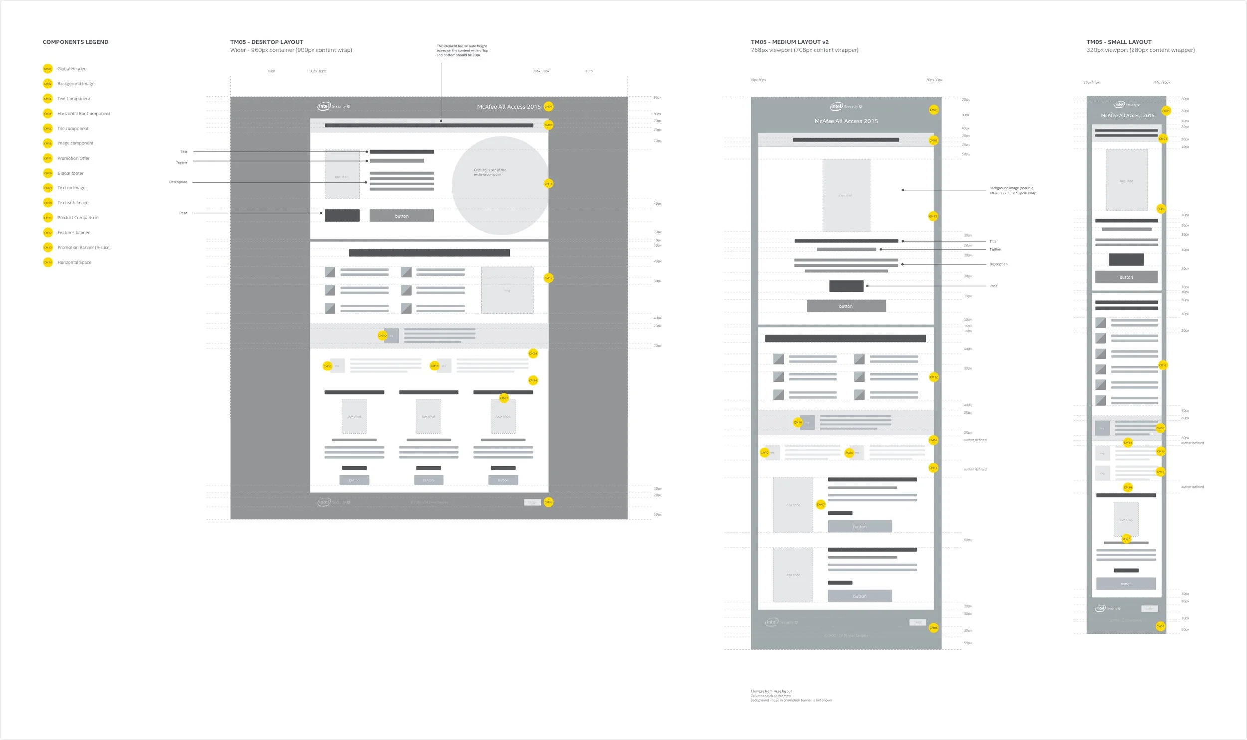
As we worked through this process, our team received sign off on updated company visual design guidelines, and as such, I needed to incorporate those refinements into the promo page specs.


Each component needed multiple variations (we capped it so as to not get carried away with more than we could initially handle) for large, medium, and small views (screen widths were determined by our analytics data).
Component variations were built and the pages were recreated in the CMS. So far, so good.
LEVERAGING OUR DISCOVERIES
The agency had a large body of work ahead of them, and our research would provide the framework for their designs. It was important that they understood our research findings and the interaction patterns that users felt would help them find the product(s) they truly need.
Appropriate Guidance
Wizard patterns are occasionally scrutinized by users because often times they feel they are being led down a path which ends in the most expensive product; regardless of their needs. Businesses opt not to use them because often times they want to force the most expensive product on the user.
We discovered that most users struggle to understand digital security as a paradigm. Furthermore, our product names don’t help them identify what’s best for them. Therefore, it is important that we provide methods to guide the user to the product or group of products that are relevant for their needs.

During testing, users were delighted by the experience of being guided to the right product. The confusion of digital security, for them, outweighed the notion that there was any chance they were being baited.
Establishing Trust
No user in their right mind will purchase online unless they feel safe doing so. Scare tactics and dark design are not conducive to building relationships and establishing trust. We want our users to return and renew their subscriptions because they believe in us, not out of fear.

Trust is built subconsciously over time. It requires not only a combination of appropriate metaphors and content on screen, but also an understanding that users aren’t necessarily ready to purchase the moment they arrive. It’s truly a balletic display of comforting tone and simple interactions.

I recommended strategically placed awards and trust badges as a supplement to page design that allowed the user to choose how they wanted to discover our products and services.
Comparing Products
Product comparison charts are a familiar pattern in online shopping, and it was important that we maintained it in the redesign.

Security products are littered with terms (firewall, malware, etc) that only advanced users understand. The goal was to maintain a traditional comparison chart pattern, but clean up the content in a way that users could identify with.
After much debate, the business decided to maintain legacy terms (as seen in the mockup above). Perhaps explaining to a user what malware is in an engaging way proved to be too much? Perhaps it wasn’t necessary at all. In previous studies we found that users, when presented with a comparison of multiple products they didn’t understand, would opt for the product with a balance of the “most options” and “cheapest price”.
In the end we opted to leave this familiar pattern in place as a supplemental purchasing guide rather than reinvent the wheel. Advanced users appreciated this and we targeted other areas of the site where additional hand-holding was necessary.
Subscribe or Buy Now?
This was a contentious topic among teams. The team was at a crossroads as to which purchasing model would be put in place.

The business remains undecided on which model is best. In fact, you may notice that the site currently employs both naming conventions on the same page. I thought it was worth mentioning because both of these models have a drastically different impact on the experience of both the website and the products themselves. SaaS requires more than just a service running in the background. It warrants an ecosystem of user-friendly products and services that work well with one another – that compliment each other – that prove valuable as a package.
We’ve encouraged this for a while now; however, McAfee has had challenges making it work. The business has yet to decide, and that is a difficult pill to swallow considering where we are in the project.
No More Dark Design!
The original website and supplemental promo pages were peppered with dark design patterns – scare tactics, if you will. I made it a personal goal of mine to eliminate these during the design process.
Users should be educated and guided, not pestered and made fearful should they not decide to renew. Unfortunately, these tactics do in fact work, and revenues generated in the short term translate into “wins” in the mind of the business. The reality is, this strategy is very short-sided and creates greater challenges down the road.

Eliminating dark design patterns and genuinely empathizing with our users’ needs establishes trust and better long-term relationships. I did my best to ensure that this redesign was free of the “bait and switch” that had lingered for far too long.
EXECUTION
Agency Handoff & Communication
We brought Web Enertia onboard to complete designs for subsequent phases of the initiative. My role moving forward was to ensure that they were adhering to our design principles and guidelines, as well as to guarantee cross-functional team communication.
Parallel Streams
As we began to march along, Web Enertia would often leverage our internal team for design guidance; resulting in parallel design streams. I led a group of 5; including 2 business analysts, an interaction designer, a visual designer, and a content writer throughout the course of the project’s second phase. Our team was responsible for providing stories and flows, as well as occasional wires, content, and visual assets that the agency needed in order to refine the final visuals and subsequent code.
On the engineering side, efforts were split across two teams. Web Enertia handled development of the front end code and then passed it on to our internal team to create components for use in the CMS. While this was the most effective method of development, we found ourselves challenged by the learning curve of the CMS, and as a result, bottlenecks were introduced.
Stakeholder Signoff
A challenge that all designers face; and given the scope of the project and staggering amount of teams that it touched, stakeholder signoff proved radically difficult to achieve.
Web Enertia, project management, and I did everything in our power to include as many stakeholders as possible from the beginning despite what appeared to be a lack of interest in our design reviews. Teams that did show up would often make their way down dead-end debate paths surrounding design interpretations that lacked concrete data or a general understanding of design principle.
“Teams that did show up would often make their way down dead-end debate paths surrounding design interpretations that lacked concrete data or a general understanding of design principle.”
Fortunately, our consumer design team had been working on a set of internal design principles that happened to achieve executive signoff early on in the second sub-phase of the project. With these firmly in our quiver, we had a greater ability to pacify skeptics and gain trust across the broader teams.
Launch
In early Q2 2016, we launched. Our homepage, product catalog pages, and product detail pages were being served up to a subset of our audience in North America. The team was excited and we began collecting data.

CART
Then in early Q3 2016, our new cart design went live. More excitement, more data. The cool thing was that we saw an immediate improvement in conversion across the board.

We decided to maintain a persistent cart but also allocate the majority of the page real estate to the form interactions. We also redesigned all forms so that they conformed to a one column layout instead of two (save a few related fields).
Fortunately, the new CMS allowed us to flip cart orientation as well as form orientation for optimization.

We discovered that users converted better on multi-page checkout environments; particularly on mobile. Upon further analysis, we realized that most users preferred being served page information in digestible and manageable chunks. We felt comfortable leveraging this type of cart pattern for the redesign and marched forward with it.
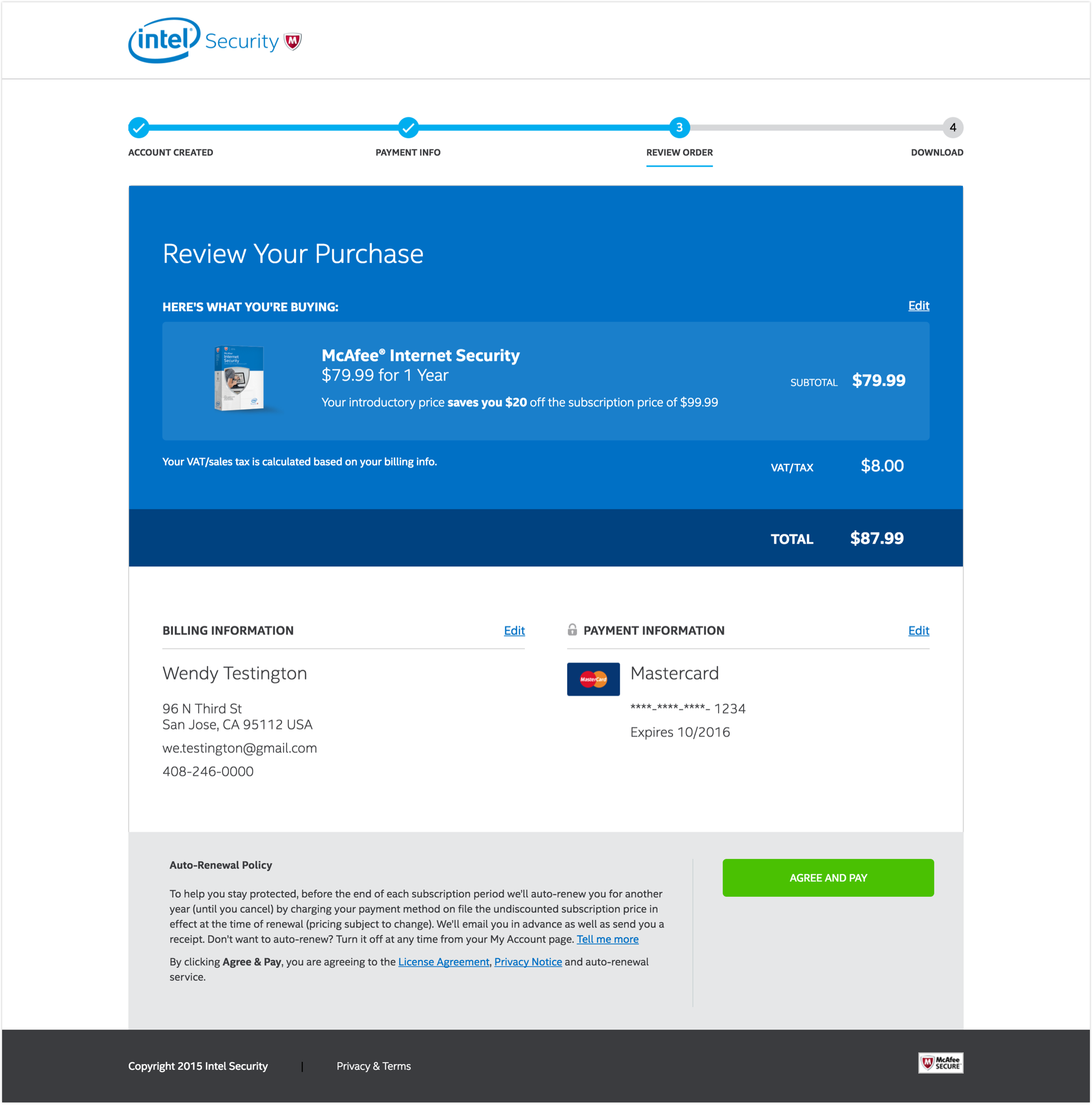
We adhered to ecommerce best practices and simplified the cart experience immensely, but the interaction that needed the greatest focus was the download page and subsequent installation experience (which our team did not touch).
We found that a good subset of our customers had purchased a product yet never even installed it. How could this be?
The redesign ensured the download call to action was clear and conspicuous, and provided appropriate feedback afterward. We’ve seen significant improvement in the install rates as a result.

IMPACT
Ultimately, our goal of integrating a scalable, responsive CMS driven consumer homesite was successful. On the fly testing and updates can occur instantly rather than once a year, and our team can analyze data on a much more granular level; leading to better insights and future improvements.
The impact on the North America numbers was immediately apparent.

While some areas of the site showed improvement and others showed challenges, the greatest impact was the live reality of a robust CMS; allowing the team to test and make changes on the fly.
REFINEMENT
The ability to A/B test pages is something the team hadn’t been able to effectively and efficiently do before. Now a reality, the marketing team is able to identify pages that aren’t performing as well as others and then turn to our CXD team for help supplementing their findings with old fashioned usability testing.
Dozens of tests have been run since the site went live; however, with great power comes great responsibility. As is often the case when looking to pivot quickly, businesses can interpret analytics data as the sole performance determinant and decide to make changes without asking themselves one simple question – why?
The reality is, internal usability testing is bandwidth constrained, and most changes are made without looking at any qualitative data / user feedback – just quantitative data. In the world of ecommerce, performance data speaks volumes, but we must not lose sight of user-centered design. Making page-level design changes without truly observing how customers interact with it is folly. The team continued to look for ways to improve upon this process.
Concessions
Regardless of the insights we provide, concessions are often made during the product design life cycle.
Despite overwhelmingly positive user feedback for a video as a primary interaction pattern, the business decided it was best to not focus efforts on product awareness and revert to less strategic ecommerce patterns (force an above the fold call to action the moment the user arrives) – a strategy drenched in optimization, not solving a pain point for the user.
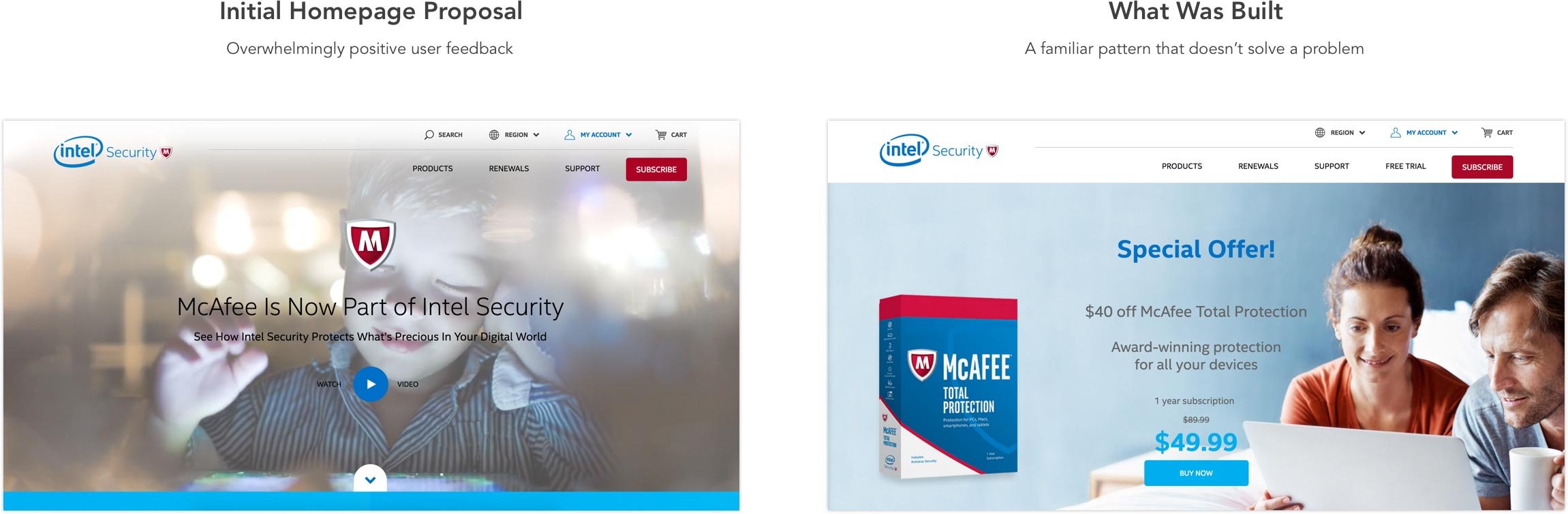
The reality is, users aren’t ready to buy the moment they arrive. Trust and awareness must be established first. The business moved forward with design patterns that felt familiar to them but that diminished the experience for the user.
Usability participant quote:
“With software protection I don’t know what its doing. I download it and hope its doing something. I guess its working. I hope its working.”
The video (if executed correctly), along with other proposed interaction patterns, gave us the perfect opportunity to address user’s concerns.
Unfortunately, this theme continued in other areas of the site until it ended up becoming a reduced version of our original proposal.
RETROSPECTIVE
This project began as a major and exciting undertaking for me; however, as we moved along, my once grandiose vision and expectations for the site were slowly chipped away at; leaving a bit of frustration – and here’s why…
I had difficulty moving from a UX design role to a management role “mid-stream“. The momentum I had built up was thrown off a bit, and while passing that over to the agency was fine, a lot of the discoveries we made in the research phase were challenging to articulate to fresh eyes.
Of course, we eventually got back up to speed, and to be fair, the agency handled the project with grace considering the complexity of it all.
Now, if you were to ask me if I’m proud of what was released, I’d say yes – absolutely. While there were design concessions made in order to meet business objectives, I must remember that the experience of using the site impacts both external and internal users. External users now have a more delightful shopping experience, and internal users (employees) have a more robust, streamlined experience for getting our products and product updates in front of new and existing users.
A designer’s pride shines brightly in his or her work, but what’s truly important is what our users think; and whether or not the product is being used. While I’m not completely proud of all the design decisions that were made, I am proud of what we all accomplished for the company.
WHAT’S NEXT?
The project has maintained its momentum and continues to evolve at full steam. Our marketing team conducts tests and updates weekly; all of which lead to a better holistic shopping experience for our users. The research and efforts made early on have informed better design decisions despite the business attempting to optimize rather than solve problems.
All things considered, the CMS integration itself has helped us develop a consumer web property that performs better than it ever has. It has been a big win for the company.
Marketing intends to have the remaining pages migrated by next year; however, we have a supplemental challenge to deal with – the roll back to the McAfee brand. In September 2016, Intel sold 51% of its stake in Intel Security to private equity firm, TPG. The intent over the next year is to perform a brand rollback to McAfee; which is more of a thorn in the side of the business than anything.
In addition, our efforts to get the My Account portion of the site into the CMS are yet to be scoped. I suspect that planning will commence soon, and it’s imperative that the team conducts additional research on how users interact with this area. I like to refer to this as Phase 3.
THANK YOU
If you’ve made it this far, congratulations, and thank you. I hope you learned something about my process.
If you take anything away from this case study, I think it’s important to understand that ecommerce best practices and visually pleasing design mean nothing if you don’t understand a user’s shopping intentions and needs up front.
Cheers!
DVL