BOOKAPOD
How do you create a mobile ticket purchasing app for public transportation infrastructure that hasn’t been built yet?

Project brief
The SMSSV (Sustainable Mobility System for Silicon Valley) is an interdisciplinary project currently underway at San Jose State University to help bring rapid public transportation to Silicon Valley.
Bookapod (book a pod, get it?) is a graduate school project I worked on with the help of 3 fellow students. The goal of the project was to design a mobile ticket purchasing application that would theoretically allow daily commuters to conduct their ticketing transactions on their mobile devices.
This is how we conceived it…
MY ROLE
I was responsible for all of the mobile interaction design, visual design, content, UI spec documentation, promotional video, and supplemental asset creation for Bookapod.
I led and oversaw these efforts from August 2013 – December 2013.
Commuter / Traveler Needs
I helped establish personas with the help of the team, and then personally devised empathy maps, scenario maps, task flows, sketches, and wireframes to help articulate user scenarios and interactions.
A VOICE FOR THE USER
Being as the infrastructure of this transportation system was merely in an “ideation” phase, core business requirements had yet to exist; however, with the guidance of the SMSSV board at SJSU, high-level requirements were translated into stories that addressed the core needs of potential users.
DESIGN LEADERSHIP & COORDINATION
Designing products takes a village. No one person can go it alone. Understanding this allowed me to work collaboratively with others on the team; ultimately allowing all of us to coordinate our strengths for the greater good. Each one of us needed to essentially act as a Product Manager for our respective contributions to the app, and I took the lead on interaction, visual, and content strategy; leveraging that thinking to produce final stakeholder deliverables.
THE SERVICE
The details around supporting this type of transportation infrastructure.
Present mobility and transportation options are becoming increasingly challenging in dense urban areas. The SMSSV (now more affectionately known as The Spartan Superway) is an interdisciplinary project at San Jose State University that is aiming to bring a sustainable transportation alternative to Silicon Valley (and beyond) – leveraging renewable resources at its core.
One such solution would be “pods” that travel along an above ground or suspended rail system. This infrastructure aims to be non-impeding on existing urban locales and would help to decrease the dependence on hydrocarbon fuels, decrease congestion, and decrease the use of raw materials for automobiles to name a few. In fact, Elon Musk’s Hyperloop aims to accomplish the same goal.
While there is much work to be done to physically accommodate a project of this scale, our team’s job (and for the purposes of this project) was to conceive and design an application that would not only allow potential travelers of said service to purchase a ticket with their mobile device, but do it in a simple way that accommodates perhaps the most critical travel constraint… time.
THE CHALLENGE
How do we design an app for a service that doesn’t exist yet?
While there are many existing constraints for getting a project of this scale off the ground, I want to focus solely on the mobile app design constraints for the remainder of this case study.
Any seasoned traveler understands how to schedule a departure location and destination given that most travel itinerary is based off of a pre-determined schedule (e.g. bus schedules, airline schedules, etc); however, like Uber in a sense, the SMSSV will rely on a system that is constantly moving. There are no set schedules – one hails an Uber and it arrives a few minutes later. Similarly (but the inverse), users of this type of system would most likely expect to be able to purchase a ticket, get to a pod station, and hop on.
In order to travel with this kind of efficiency, we approached the design of the application with a unique core strategy – design it in such a way that the user doesn’t need to worry about time.
Let me explain…
FRAMING THE APPROACH
Given that our project did not need to adhere to engineering constraints or even physical constraints, we had a relatively blue sky to approach the app design in any way we chose. Focusing solely on what our personas see, feel, think, and behave as well as by making time the central tenet, we were able to come up with a solution that gave users the ability to purchase tickets without having to worry about rushing to make their pod (an approach that other teams overlooked).
What would the user prefer?
Receive QR code and scan on arrival?

Get to the station before time runs out?

Upon discussing the physical architecture of an “on-demand” pod system with the engineers on the project, it was apparent that these pods would need to be plentiful and convenient. In order to service a metropolitan area such as Silicon Valley, this project would require a tremendous degree of infrastructure. As such, engineers shared a vision of pods arriving to their stations at regular intervals. Several teams in the class interpreted this concept a bit literal and moved forward with an approach that we had also considered; one that would see users frantically rushing to make it to a station before a timer counts down.
Ultimately, we took a different angle and empowered the traveler to be in control of their own schedule. Hence we based our design around the concept that a user would pay for a ticket (or multiple tickets) and be given a QR code upon completion of the purchase.

The idea was that pods would remain in queue at stations (almost like shopping carts at a grocery store), and be served up to the traveler as they scanned their QR code in at a station kiosk.
No rushing from station to station. No worrying about unavailable pods. It truly supports an “on-demand” system.
defining the flows
Leveraging the research the team conducted, I defined the user flows for every screen of the application.

Once completed, we were able to begin realizing the designs of each screen. Before we dive into the meat of the discovery phase, I’d like to show the tasks and screens central to the application.
WHAT DO OUR USERS EXPECT?
What features support our scenario analysis, and how can we design it in a way that meets the majority of our users’ needs and expectations?
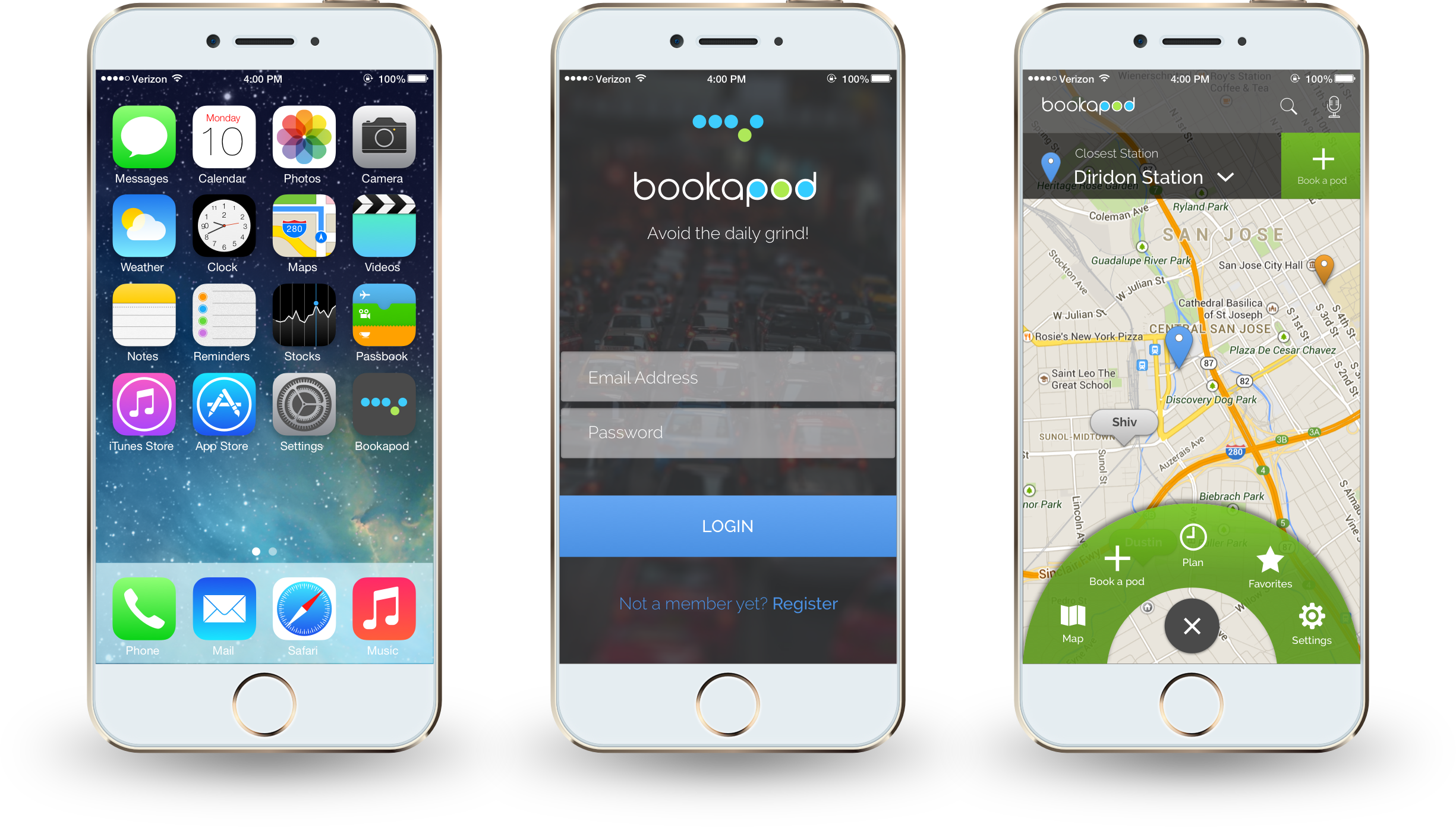
BOOKING A POD
The primary task needed priority within the app. It is accessible from the main screen as well as through the navigation wheel.

STATION NAVIGATION
Participants requested that the app provide them with instructions on how to get to stations via multiple transportation methods.

FAVORITES AND SCHEDULING
A common complaint among public transportation users was the lack of options for saving commonly used stations and scheduling among existing mobile ticket purchasing applications.

TICKET SHARING
Purchasing multiple tickets, gifting tickets, and the ability to add from device contacts were common requests from our participants.

SAVED PAYMENT METHODS
Participants appreciated the convenience of apps that saved their payment details for ease of use in the future.

FRAMING THE USER JOURNEY
Market research and survey analysis led us to what we believe people want in a transportation system like this.
Note: I’ve opted not to share the survey and market research results in this case study as I was not responsible for leading that research. I will, however, refer to these findings and explain how they helped shape the design to come.
Evaluation of our results led us to the creation of 4 core personas.


SCENARIO MAPS
Outlining these stories allowed us to ensure that our design would be grounded and meet all of our personas’ needs.
EMPATHY MAPS
By empathizing with the user about what they hear, see, think, feel, say, and do, we are able to begin bridging the gap between our personas and our future design.

A DESIGN FOR COMMUTERS
This is how we did it
Sketching wires, digitizing them, prototyping, and moving forward into the visual design phase was accelerated for a few reasons. One, this was a graduate school project and was intended as an exercise in process. Two, I was the sole interaction designer on the team, and they graciously trusted me to have the final say on design decisions. Three, minimal stakeholder numbers meant quick turnaround times.

TIME IS not OF THE ESSENCE
As noted earlier, the team conducted a survey to understand what was most important to our target audience. Travelers expressed a common priority dissatisfaction of current public transportation services due to lengthy wait times. We used this feedback to design the app in a way that puts the user in control of their schedule, and additionally gives them the ability to plan their route without worrying about missing their pod.

THE QR CODE
We based the design of the app around this simple concept and worked outward; creating the supplemental functionality.

NAVIGATION OPTIONS
Pivoting through the app was a point of design contention for me. While 90% of users are right handed, I wanted to ensure that navigating the app was equally accessible for both lefties and righties. Why should lefties be left out?
More importantly, commuters are:
Often rushed
Preoccupied / Distracted
Constantly looking at their devices
We explored 4 primary navigation patterns and found that users preferred what I refer to as ‘the wheel’. Its hand-agnostic design and larger size was preferred by the majority of users during the mid-semester prototyping phase.

THE WHEEL (OPTION 4)
Participants preferred this pattern overall due to its central location on the screen. Its size was also a favorite as it was large enough to navigate, but not too large that it occluded important information underneath. Furthermore, users found the wheel easy to toggle on and off, and expressed their delight over the uniqueness of it.

NOT ALL COMMUTERS ARE THE SAME
Some commuters take the same routes daily, and others switch it up. Designing for that flexibility was important, and as such we created a route scheduler that forgave users for changing their plans.
Our participants taught us that our app must have:
The ability to add / remove stations from their route
The ability to quickly pull from a list of favorite stations
The ability to plan ahead and create schedules for future use
The ability to save, name, and edit those custom routes
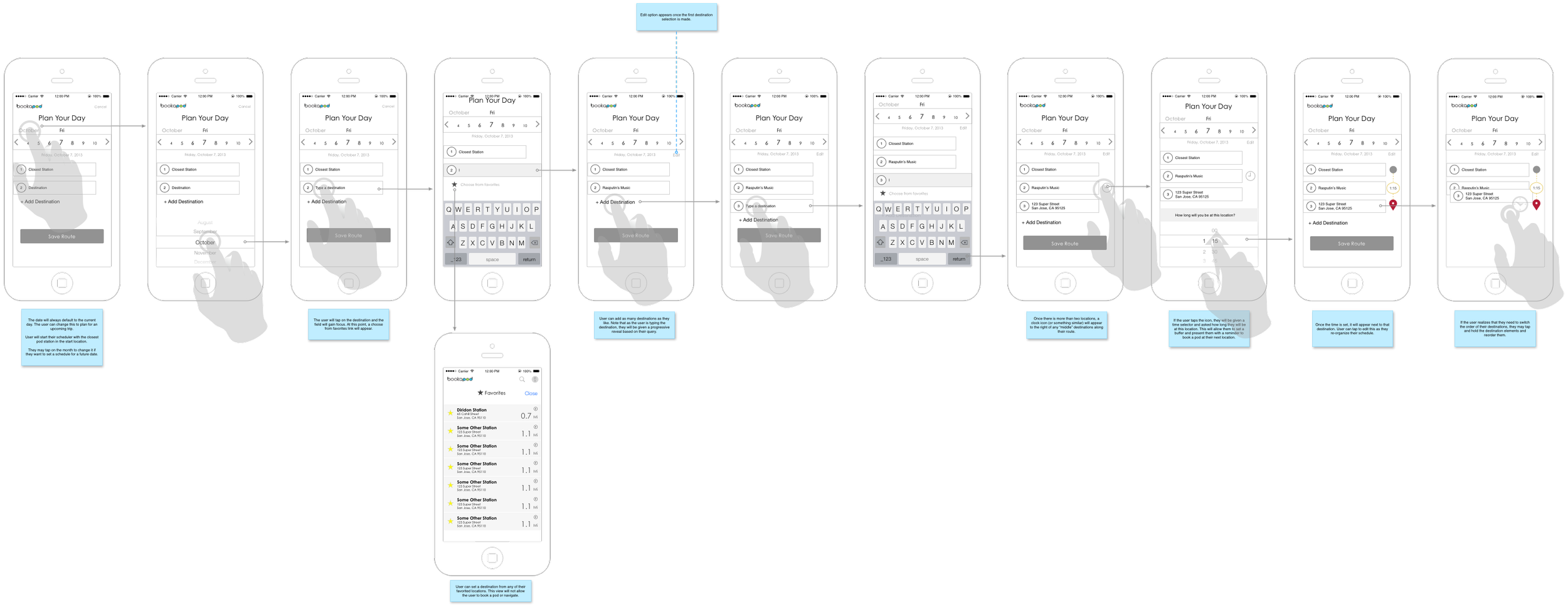
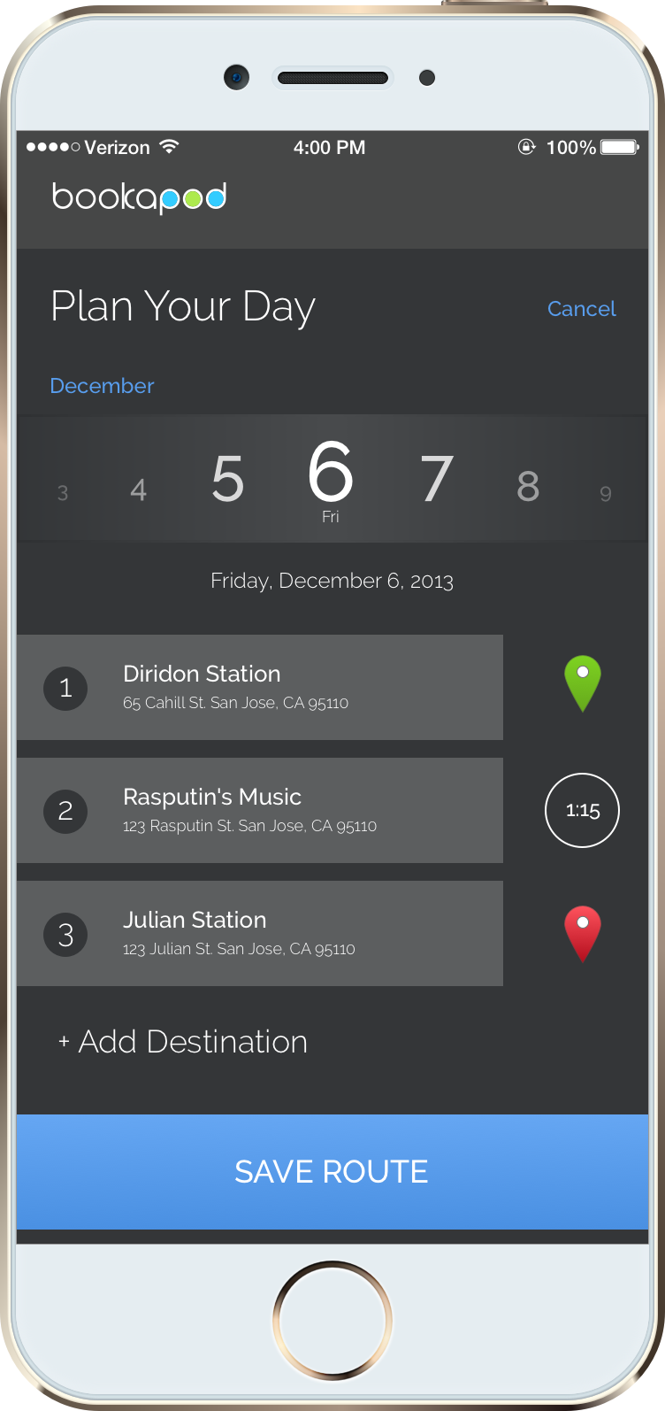
PLAN YOUR DAY
Participants asked for the ability to pre-plan routes, and then save those routes for future use. I used their requests to create a route planner that allowed for scale as the commuter’s travel needs changed.
PAYMENTS ARE A SNAP
It was crucial that the application had the ability to store multiple payment details. The majority of our participants expressed that they were comfortable setting up and storing these details on their mobile device. In addition, current public transportation payment options needed to be tied into the app as a convenience for travelers familiar with other systems (e.g. Clipper Card).
Any time a user is asked to store payment details, a high degree of trust must be established. In my experience, I’ve found that this is driven by conspicuous content and visuals. Our participants expected the following:
The ability to add their payment credentials
The ability to edit those details, as well as remove them down the line
The ability to quickly access stored payment details during the pod reservation task
The ability to pay for a pod reservation without saving payment details during the pod reservation task

SAVED PAYMENT METHODS
Bookapod allows the user to save, edit, and delete all major payment methods, as well as leverage existing public transit payment options directly within the app.

ACCESSIBLE NAVIGATION FOR EVERYONE!
As expected, users voiced the need to be able to see distance / times for multiple modes of transportation to nearby stations (i.e. walking, cycling, driving, etc). In addition, users wanted to know their position once they were on the pod.
During the first iteration of the app design, I intentionally created options for walking and driving only. I did this initially in order to keep the prototyping work to a minimum, as we were under a tight deadline. Future iterations of the app would certainly include those options, but what you see here is a simplified version.
The following was expected functionality:
Closest station and alternative stations must be shown on the map and easily selected
Distance / times for multiple transportation types (walking, biking, driving, bus, etc.)
GPS turn by turn navigation
Current location while the pod was in motion
Previous and upcoming stations on a set route
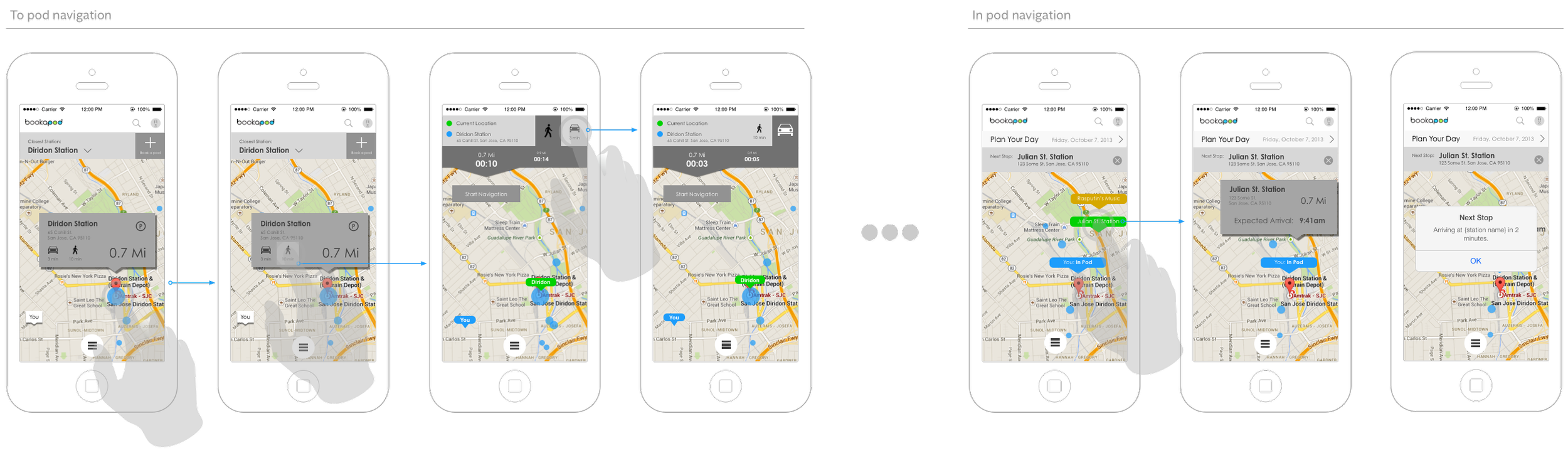
GET TO THE STATION!
Just kidding… free to take your time. Bookapod is designed so that you don’t have to rush to make your pod. Simply get yourself there at your convenience and a pod will be available on demand.

SPECIFYING THE DETAILS
A major portion of my responsibility was to create an end to end UI specification document as part of our final deliverables. While this documentation never made its way into an engineer’s inbox, it was designed with the intention of communicating precisely how the application should be built.

ADDITIONAL DELIVERABLES
In addition to the complete UI specification document, I was also responsible for the promo video at the top of the page. Animations were done in Keynote and music was purchased from a stock service.
I created two rounds of prototypes in Keynote and presented them mid way and at the end of the semester.
RETROSPECTIVE
A few years have passed since this project was conceived, and while a finished product was never intended to come from this exercise, I do like to think that our team created a highly acceptable baseline. In fact, the SMSSV engineering team asked our group for access to all of our documents at the end of our final presentation (but that’s a story for another time).
It’s important to note that the SMSSV team continues to move ahead at full steam in hopes of making this idea a reality. Should they ever need assistance, I’d be happy to participate.
WHAT I LEARNED
Process. Pure, unadulterated process. The core of any good interaction designer’s thinking. And while it was a lesson in process, it provided a sound framework for the challenges and initiatives I face today as a professional product designer.
Most UX designers nowadays work in environments where they are required to fulfill a fraction of these roles. A UX designer may only be responsible for wireframing, prototyping, and contributing to the final spec. BA flows, visual design, and content may be the responsibilities of other members of the design team. Is it nice knowing that if I am in a situation where I’m called on to fulfill all of these requirements, I can, but that just isn’t reality in most cases. Anyway, on to the meat of my learnings…
WHAT WAS THE IMPACT?
This isn’t so much a learning as it is an understanding. An understanding that this app was never intended to be built or used. There weren’t any business objectives to contend with or stakeholders to appease aside from the administration. As such, we’ll never know the impact. We’ll never know if it satisfied our personas’ expectations. We’ll never know if it helped grow a bottom line; and most importantly, we’ll never know if the app solved a problem because we can’t measure the outcome of our work. However, I do think I speak for the team when I say this project had a positive impact on us as UX professionals. While it took place in a vacuum, it was an end-to-end, holistic representation of what a professional UX designer can expect.
“ON-DEMAND” MAY NOT BE A REALITY
If this concept ever did become a mainstream public transportation reality, the chance of there being enough pods available as on-demand resources is probably slim. Periods of heavy commute would require a dense infrastructure of pods, and most stations would be taxed to the point of forcing commuters into lengthy queues. Our team thought through this and designed for the scenario; however, without modeling, it is impossible to foresee the impact.
THE “PLAN YOUR DAY” FEATURE COULD BE IMPROVED
We developed the app around the concept of time as a non-constraining entity; however, the initial design of the route scheduler broke that pattern by forcing the user to spin unnecessary cognitive cycles thinking about when they might arrive at a mid-station somewhere along their route. Ironically, we let our own time constraint for finishing the project supersede the importance of maintaining a consistent methodology and tone throughout the app. An extremely important lesson for future projects.
BIOMETRICS FTW!
The reality of a project like this is that by the time it actually gets built, the interactions designed here will be an afterthought. Eventually, biometric authentication will be the only payment needed. It’s scary thinking that we could soon be living in a world where banks are tied to a fingerprint…. oh wait.
Patterns like the QR code won’t be used. It’ll be a biometric auth that occurs at every step along the way. Even wilder, when we conceptualized the app, fingerprint and retina authentication was still considered “the future”. Unlocking the iPhone with a fingerprint was still a hot rumor; and while it had already existed in certain circles, biometric authentication was still very much a luxury. How quickly things change.
THANK YOU
If you’ve made it this far, congratulations, and thank you. I hope you learned something about my process and about the importance of sustainable public transportation.
Cheers!
DVL